
Rapid Branding | A New Identity for an Acquisition in Under 30 Days – Before & After
The Before:


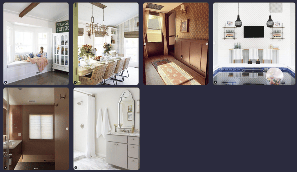
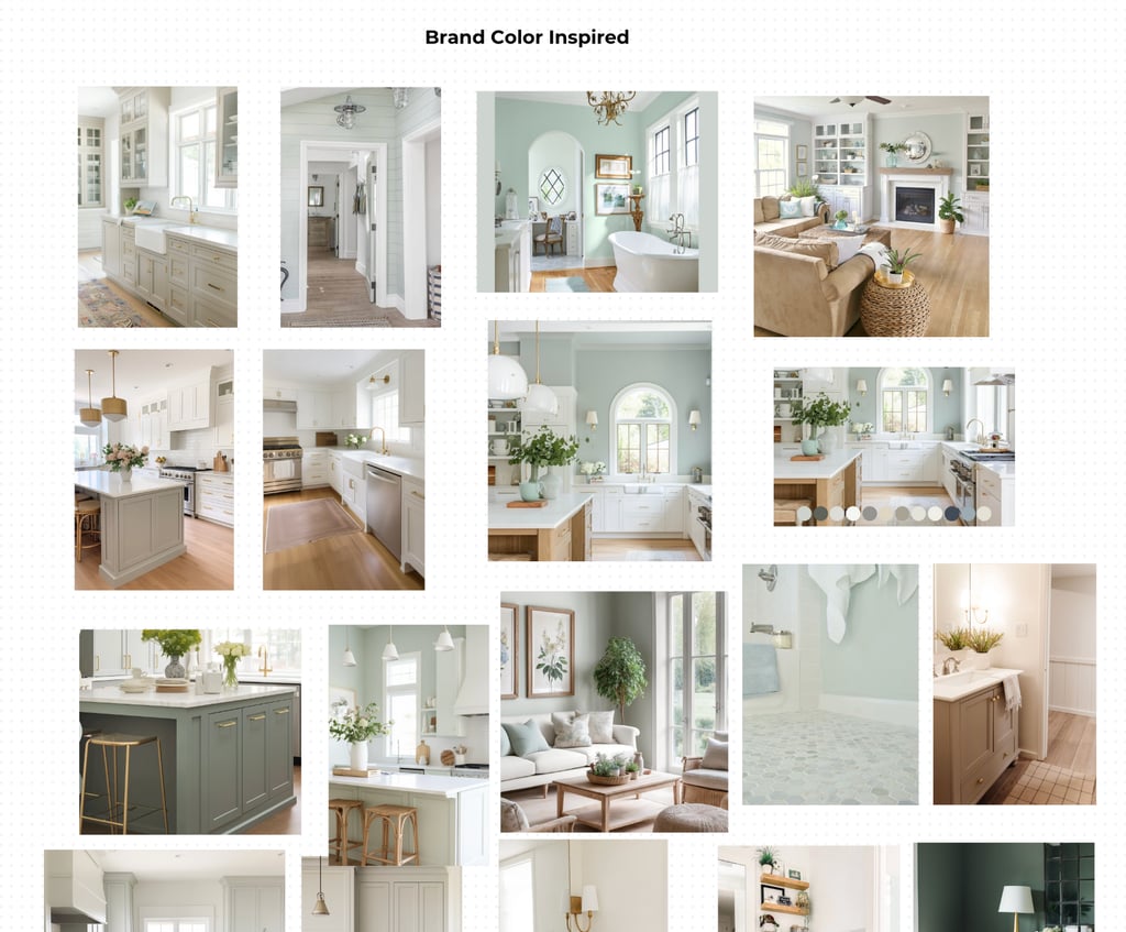

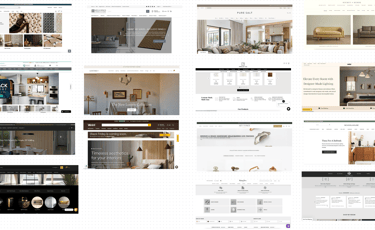

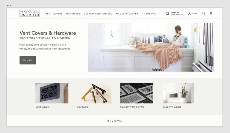
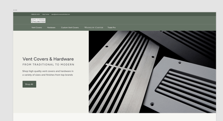
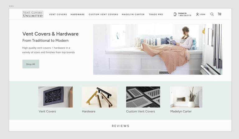


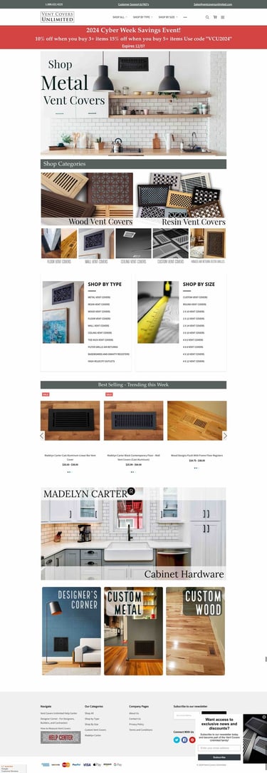
Branding a newly acquired business quickly means creating a point of view fast, without sacrificing judgment. The ask from leadership was clear: bring Vent Covers Unlimited in-house and give it a credible, differentiated brand identity on a very short timeline. I used a strategic, compressed method I’ve now applied twice.
Step 1: Competitor Analysis: Understanding the Market Landscape
I start by analyzing competitor visuals to understand the existing landscape.
Identify brands with similar products and review their logos and color systems.
Scan websites for dominant and overused colors across the category.
Note which colors have become visual clichés and which spaces feel underused.
This step is not about copying successful brands; it is about avoiding sameness. If a category is saturated with teal, the refreshed brand should resist teal. The goal is to position Vent Covers Unlimited in a way that looks clearly distinct while still feeling credible within the market.
During this stage, I also sketch how the logo refresh will look. This is Stage II: refining mark, weight, and spacing so the logo holds up both on the site and in smaller applications without breaking the newly defined system.
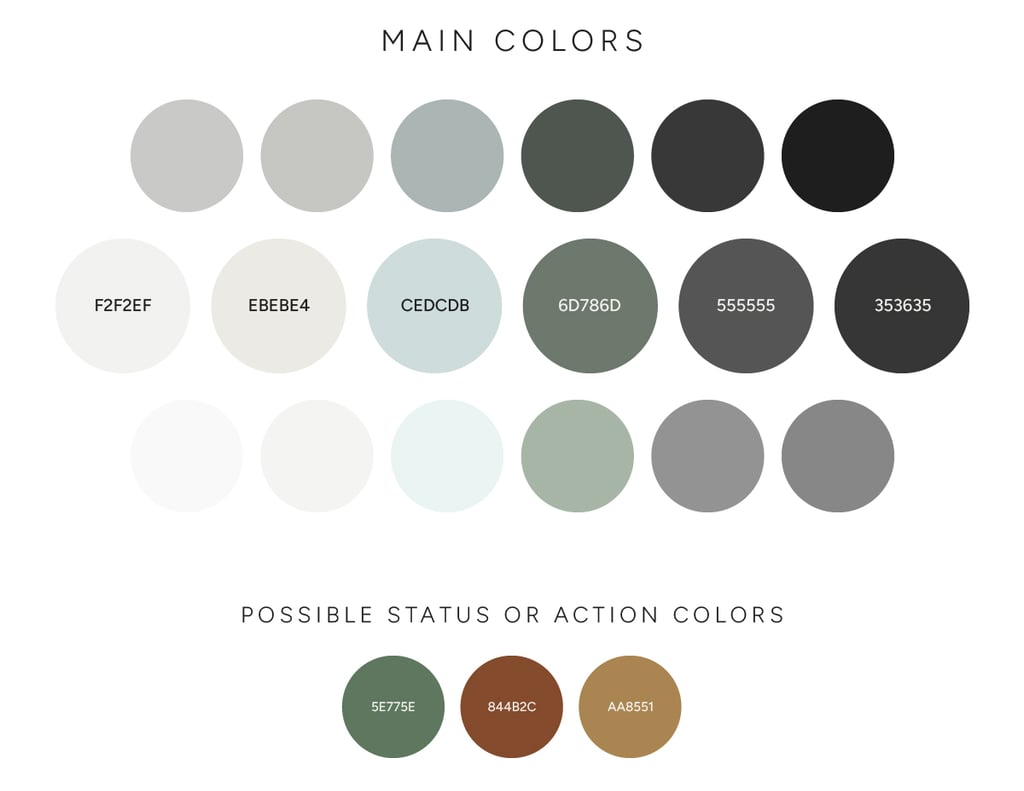
Based on that, I create a starter palette that:
Avoids industry-heavy colors identified in the competitor scan.
Aligns with customer preferences observed in real spaces.
Signals the tone and vision for the brand.
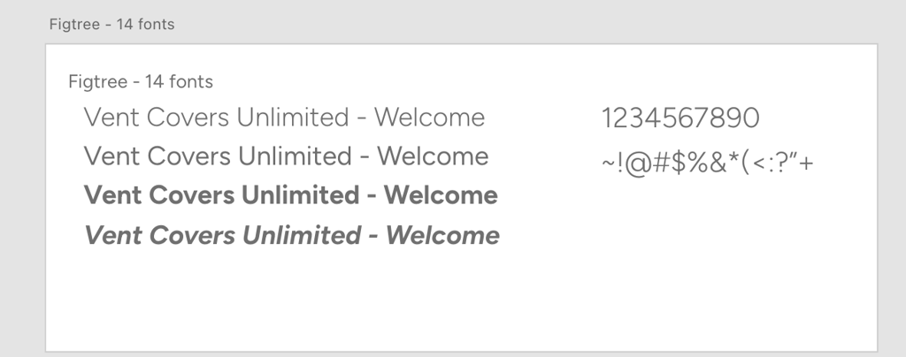
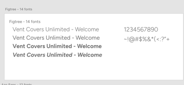
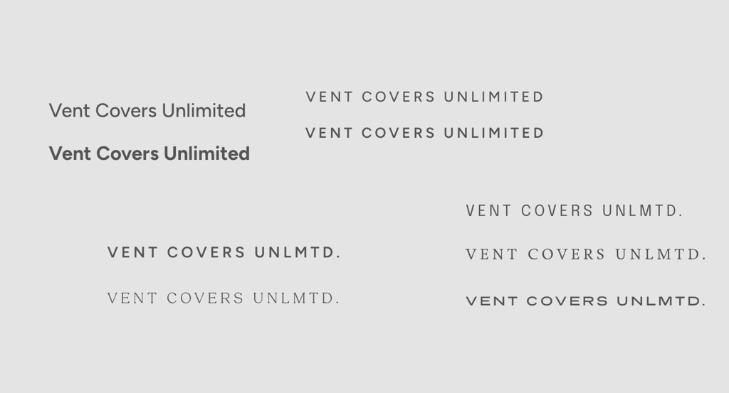
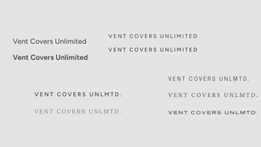
Typography follows the same logic. I select a sans-serif or serif depending on the brand’s tone and formality (for example, friendly, functional, minimal). When budget is effectively zero for licensing, I source from Google Fonts or Adobe Fonts, choosing families that will scale comfortably across web and marketing uses.
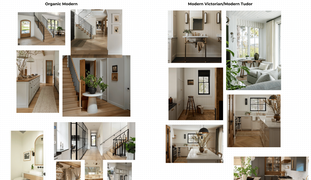
From there, I define the product styling art direction the branding will pair with. Is the context luxurious, fun, formal? Does it lean mid-century modern, y2k, outdoorsy, or something else? The identity has to sit comfortably inside those worlds rather than fighting them.
Step 4: Narrowing and presenting
Once the identity has been tested in real layouts, I narrow down to a focused set of decisions and present:
Final palette decisions with rationale tied to market and customer use.
Chosen type families, with notes on tone and scalability.
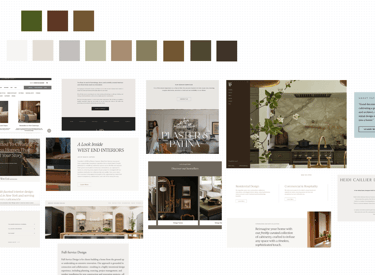
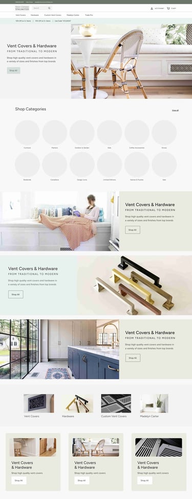
Key web mockups that demonstrate how the brand behaves visually.
Early logo refresh directions that fit the system and can be finished in the next stage.
For Vent Covers Unlimited, this process moved from initial analysis to a presentable, working identity in two weeks.
The result is a brand that looks different from competitors, reflects how customers actually use the product in their homes, and gave Renovation Brands a clear visual foundation to build on across campaigns, web, and product storytelling.
This has been a successful branding project that has been a significant part of driving brand growth through a cohesive visual story. Allowing the products to be center stage in a way that gives breathing room and sense of calm to both residential and commercial audiences.
See how the website was built since: https://www.ventcoversunlimited.com
If the brand has an in own-brand hat will be refreshed next, I prepare a starter palette for that in tandem to ensure cross-site callouts and shared components feel complementary rather than visually clashing.
Step 3: Web mockups to test the identity
With palette and type in place, I design hero web mockups to “test-drive” the branding. The point is to see the identity in motion, not just on a static board.
Apply colors and fonts to key sections of the homepage.
Adjust how heavy or light the visual palette feels in practice.
Evaluate legibility, hierarchy, and flexibility across desktop and mobile.
Step 2: Reading customer use and style
Next, I look at how customers actually use the products in their spaces.
Review the brand’s Instagram account.
Peruse tagged posts and customer photos.
Observe real interiors, wall colors, materials, and styling around the product.
This reveals the colors and atmospheres that resonate with the audience.